Improving Outcomes for 5/3 Bank Customers
Introduction
This project aimed to improve the user experience for Fifth Third Bank mobile app customers by adding features that would facilitate the application's daily use.
The Problem
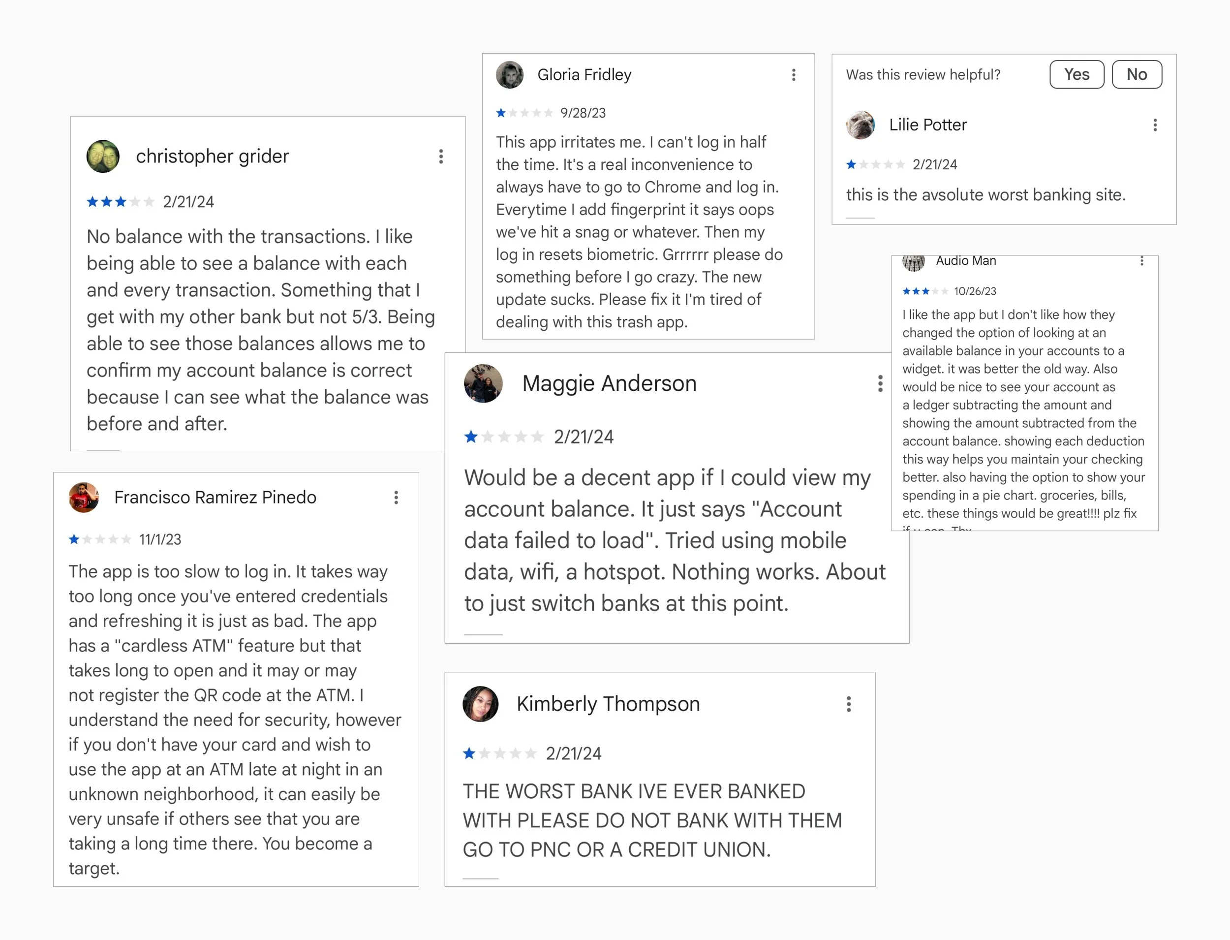
The 53rd Bank has been around for a while and they have a mobile application that doesn't do enough to handle the processes and transactions of its customers. There are a lot of negative reviews of the mobile app, and it’s obvious that there is a need to revamp the app.
Most of their processes are manual and can be improved to reduce the number of tasks users need to do and also the amount of customer complaints. Another insight is that the mobile app could be overdue for a refresh.
My Role: Product Designer Timeline: 3 Weeks
Tools: Figma, FigJam
Empathize
UX Research
By combining research methods, I wanted to comprehensively understand users' pain points with the bank application and prioritize areas for improvement or optimization.
Research Objectives
1. Learn what users like about the app
2. What users would like to change
3. What improvement user would like to see
4. How users interact daily with the app
5. Determine priorities
Methodologies
Competitive research to see what our competitors offer.
User Interviews to hear from users about their experience with the app.
Secondary research - to collate and analyze user reviews.
Research Questions
1.How important is this application to the user daily?
2. What do they use the most in the application, which feature?
3. What features are they missing to have a complete user experience?
4. Are there any features that they use very rarely?
Research Fundings:
Banking app users often use features like check deposit, money transfer, and bill payment, but they sometimes face challenges such as login issues or not being able to complete all tasks through the application. These users value convenience and suggest improvements. They prefer user-friendly interfaces that prioritize commonly used features and streamline navigation.
Secondary Research Key Learnings:
The 53 Bank's mobile application has the highest number of user complaints. Customers have reported poor customer service, difficulty navigating the application, and a lack of visibility when it comes to account balances. They are unable to perform many tasks within the application and must contact the bank directly. Customer service is bad, navigation through the application is not good enough, and there are many complaints about not being able to see the account balance. They cannot do much through the application, they have to contact the bank directly.
Opportunities:
The app might offer customization options that allow users to personalize their banking experience based on their preferences, such as setting up alerts, notifications, or account preferences.
-Register travel
-Budgeting tools
-Financial insights
-Personalized recommendations
-Innovative banking services
-Customization options
User Interviews
The purpose of the interview was to gain insights into the challenges that people commonly encounter while using mobile banking apps and what additional features they would like to have. Furthermore, we aimed to discover the experiences of 53 Bank customers with the app, their suggestions for enhancement, and what improvements they hope to see, to uncover the experiences of 53 Bank customers with the app, their suggestions for improvements, and what changes they seek.
Affinity Mapping:
I used affinity mapping to sort out all the insights that I have from participants, and then I divided them into 7 different categories.
User Personas
My two personas anticipate that they can utilize the banking application to carry out all the necessary transactions, check their documentation, and perform other banking activities. Unfortunately, the 53 Bank mobile app does not currently allow them to perform all of these tasks.
Persona #1
Persona #2
Define
Creating Point of View Statement and How Might We questions helped me clarify the problems users have and define them. Also, these were the main guidelines for the ideation phase.
POV Statement and HMW Questions
“I would like to help users with the notification of their international travel plans to the bank.”
“How might we make it easier for users to notify the bank about their international travel plans.”
“It all begins with an idea”
Ideation
The sitemap played a crucial role in my project as it helped me visualize the existing features of the application. Thanks to it, I was able to ensure that new features were placed in the right location and complied with usability guidelines.
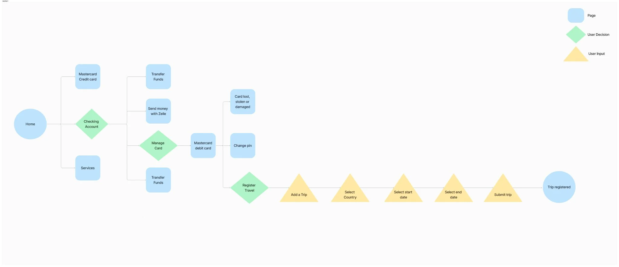
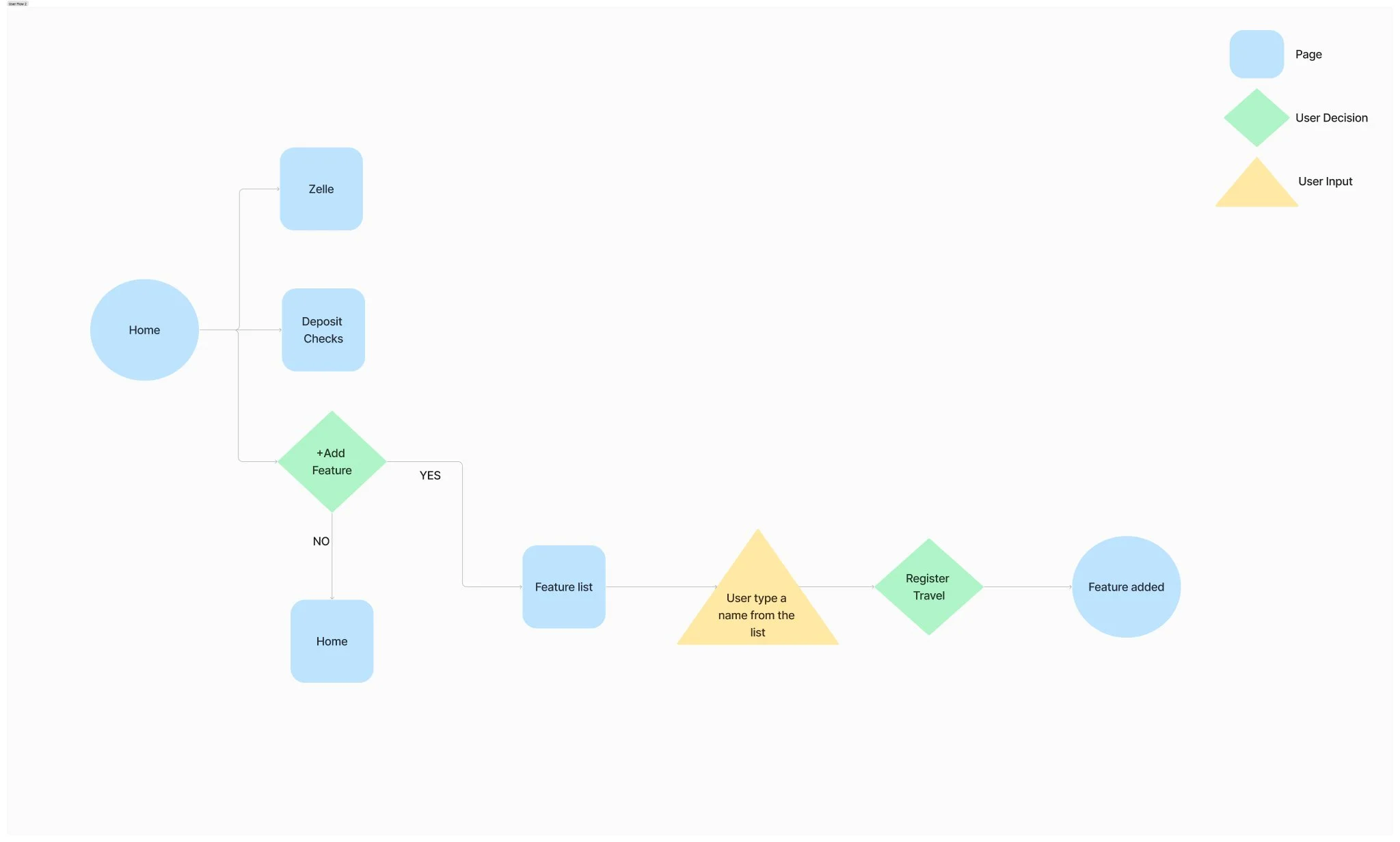
User Flow
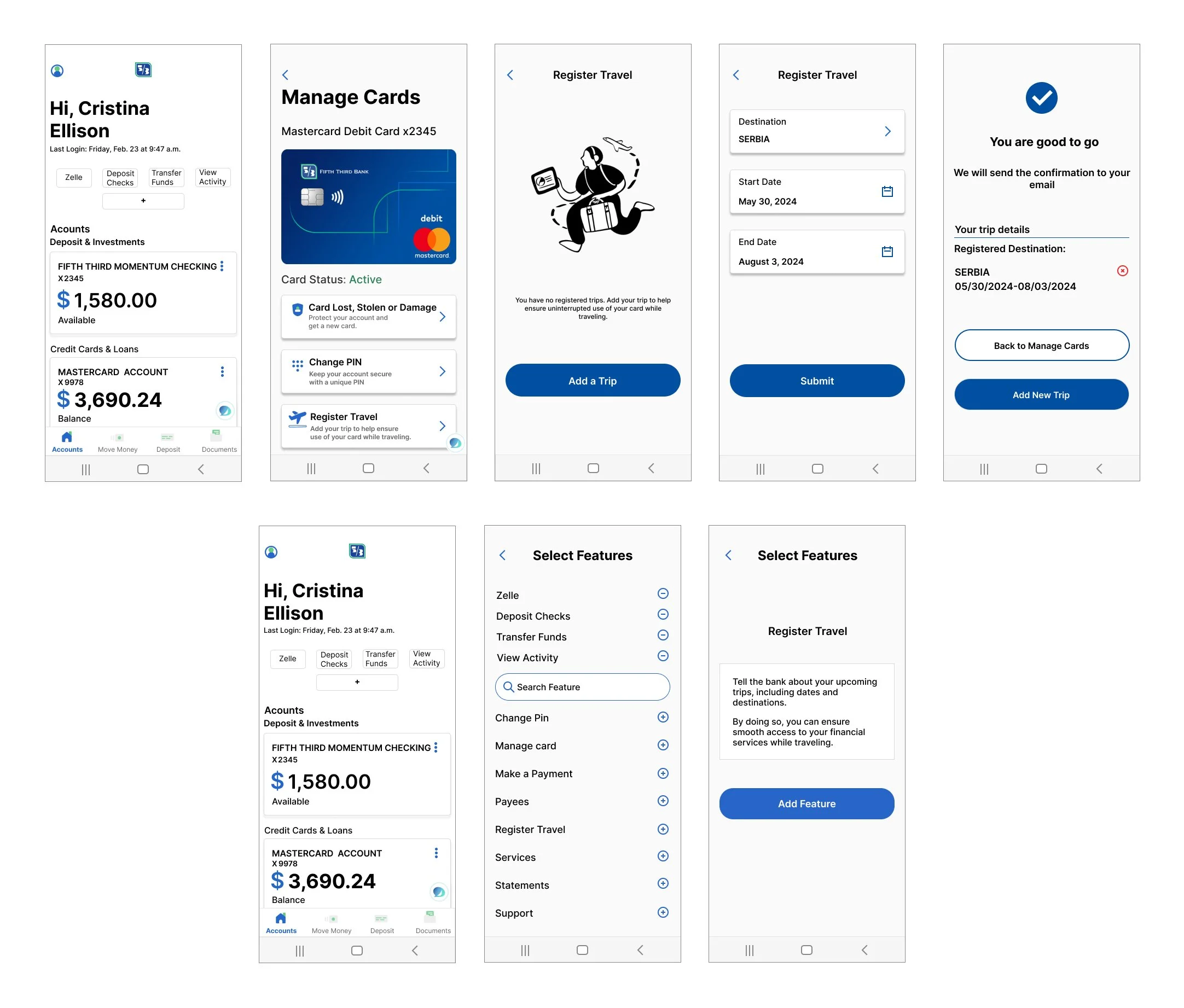
The Sitemap clearly shows that two features are added to the existing application, the first is: Register Travel and the second is Most Used Features. Here it is presented how the user will move until the fulfillment of his goal.
Flow 1: Register Travel
Flow 2: Add the most used feature to the home screen.
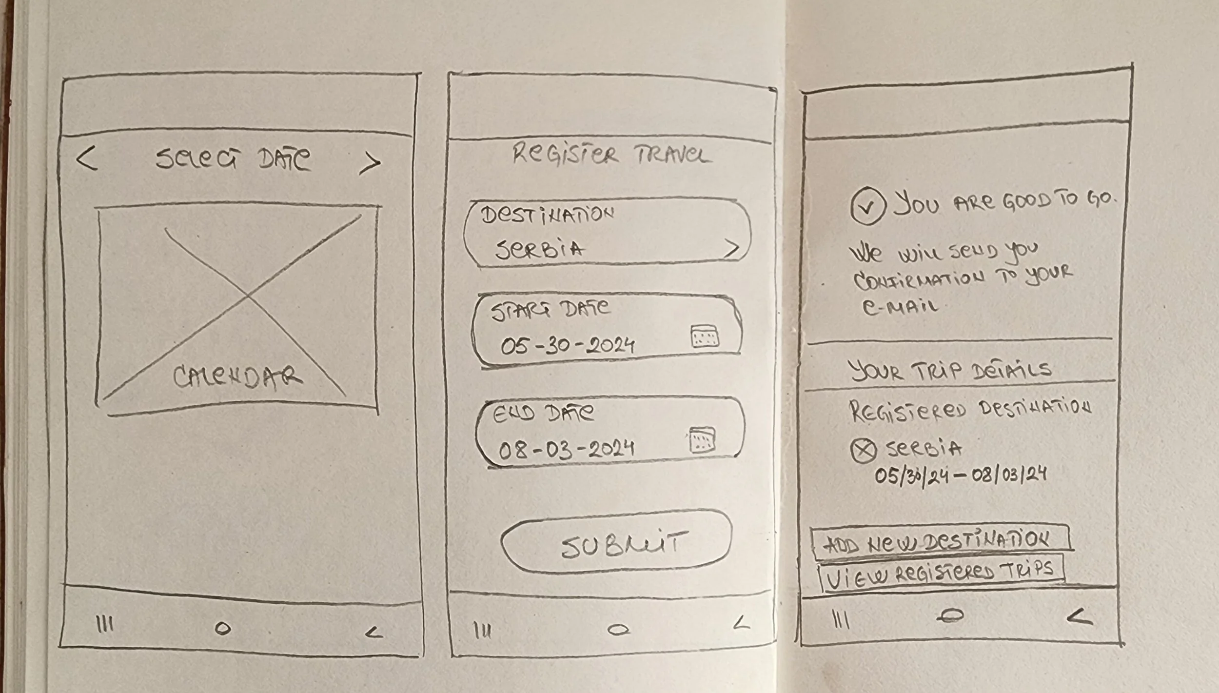
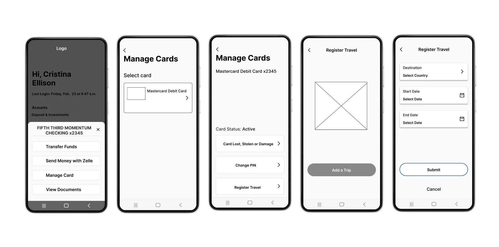
Low Fidelity Wireframes
Low Fidelity wireframes helped me to see in more detail how the main pages will look
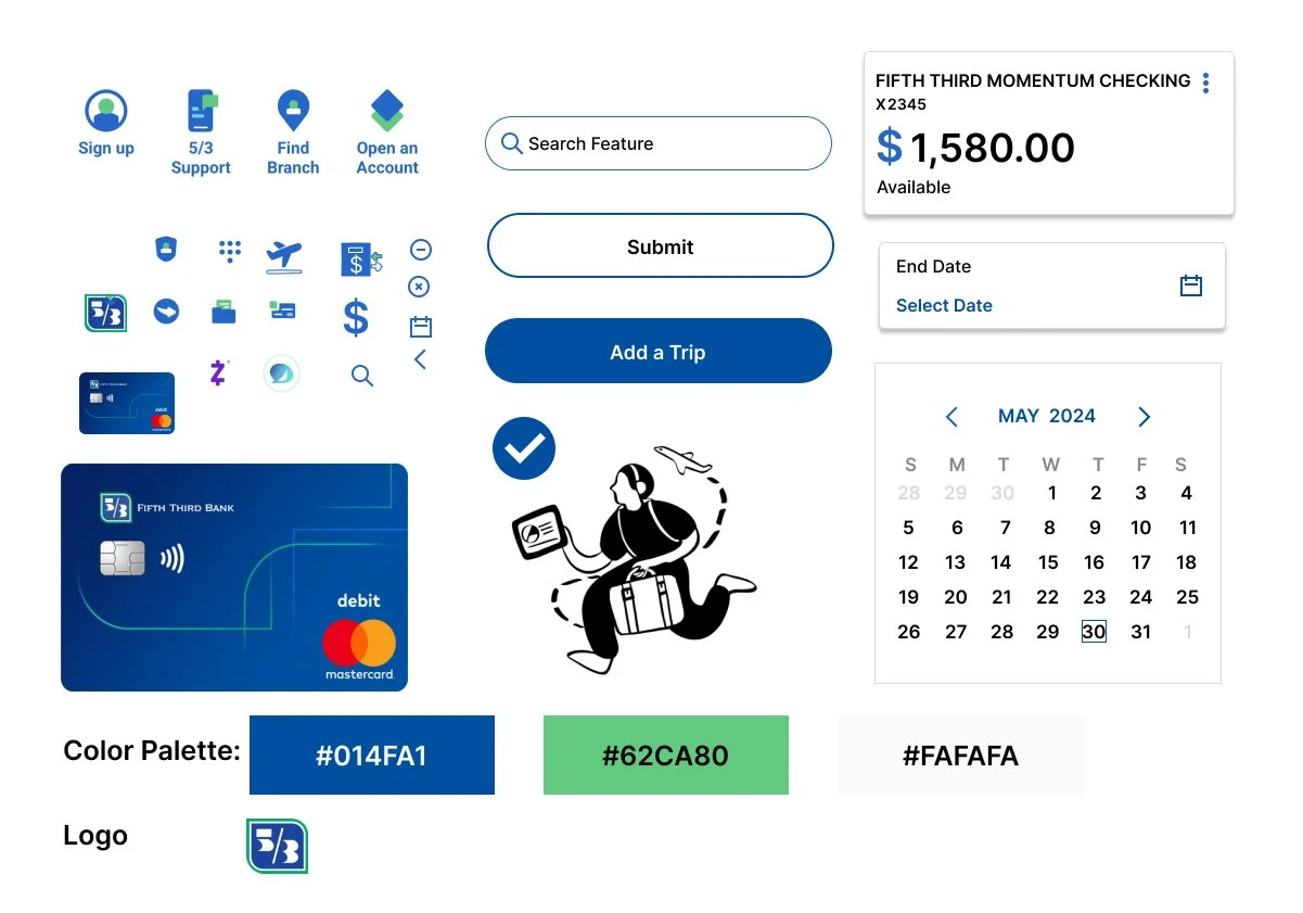
UI Design
The current application had its own color scheme, logo, and icons. I was able to identify all the necessary components and icons required for the application after reviewing a few screenshots. As the original icons were unique, I put in additional effort to create them.
High-fidelity key screens
Usability Test
Findings:
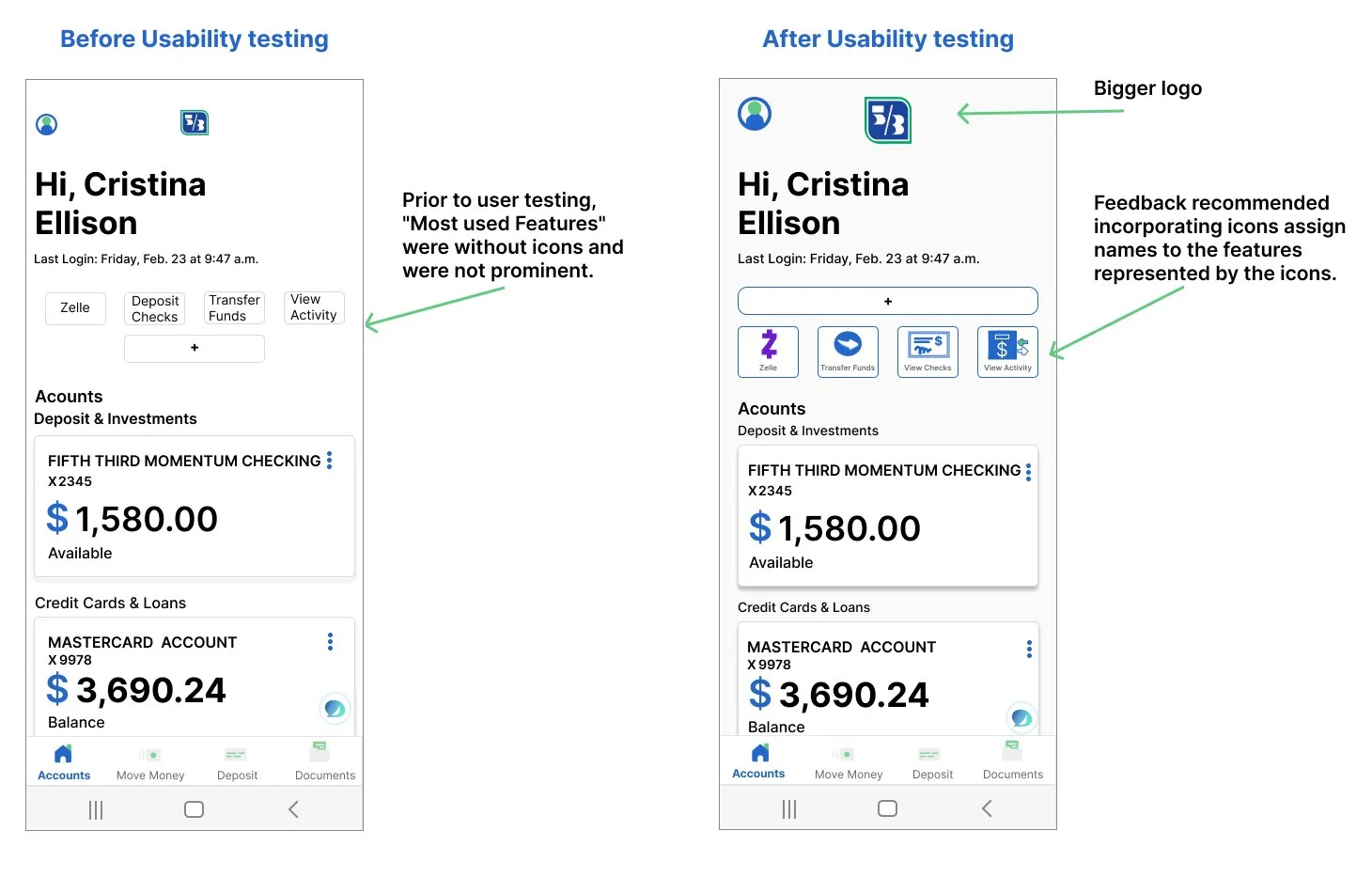
For usability testing, I had 5 participants. The participants found the feature exceptionally user-friendly and intuitive. They appreciated the clarity and logic in its design, expressing satisfaction with the predictability of each step. The task was to register the trip and insert a new feature on the home screen. However, feedback also indicated that 3 iterations were needed.
Iterations
Project prototype
Key Screens
Conclusions
I found my experience with the existing application to be very helpful and informative. However, I had limited options when it came to design, particularly about colors and UI components. I had to adjust to the pre-existing design.
The biggest challenge I faced was with the Homepage, where I had to incorporate the Most Used Feature and ensure it fit in visually without disrupting the hierarchy.
There is always room for improvement, both in terms of appearance and functionality. If I were to work on this application again, the first thing I would focus on is finding a better solution for the homepage.


